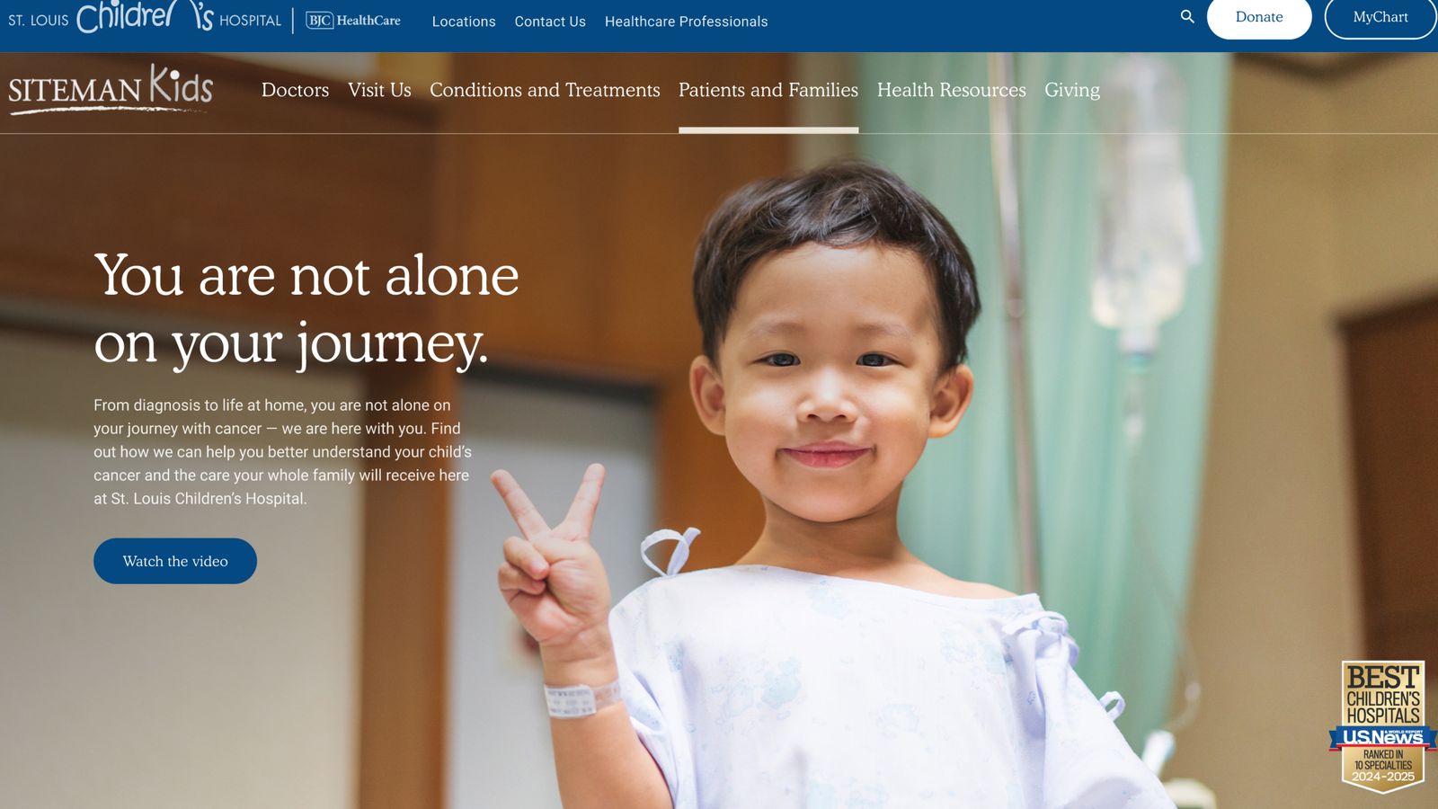
the authority of a top cancer center, made to feel like it is for real people.
A proposed redesign that keeps Siteman’s institutional expertise intact and brings the patient’s experience up to meet it.
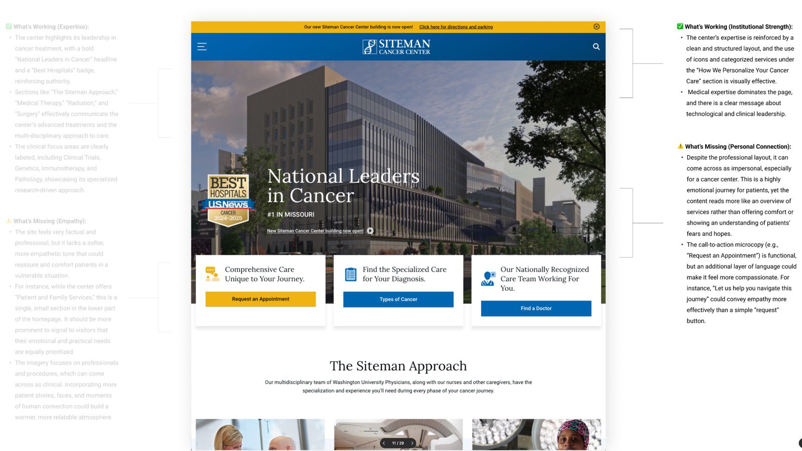
Siteman is one of the country’s leading cancer centers, and its site made that case well. The existing homepage conveyed expertise through an organized content structure, with clear emphasis on achievements and advanced treatment, and a visual hierarchy that favored institutional excellence and clinical leadership. That established Siteman as a world-class treatment center. What it underweighted was the person on the other side of the screen, often newly diagnosed and frightened, reading all of that authority with little warmth to hold onto.
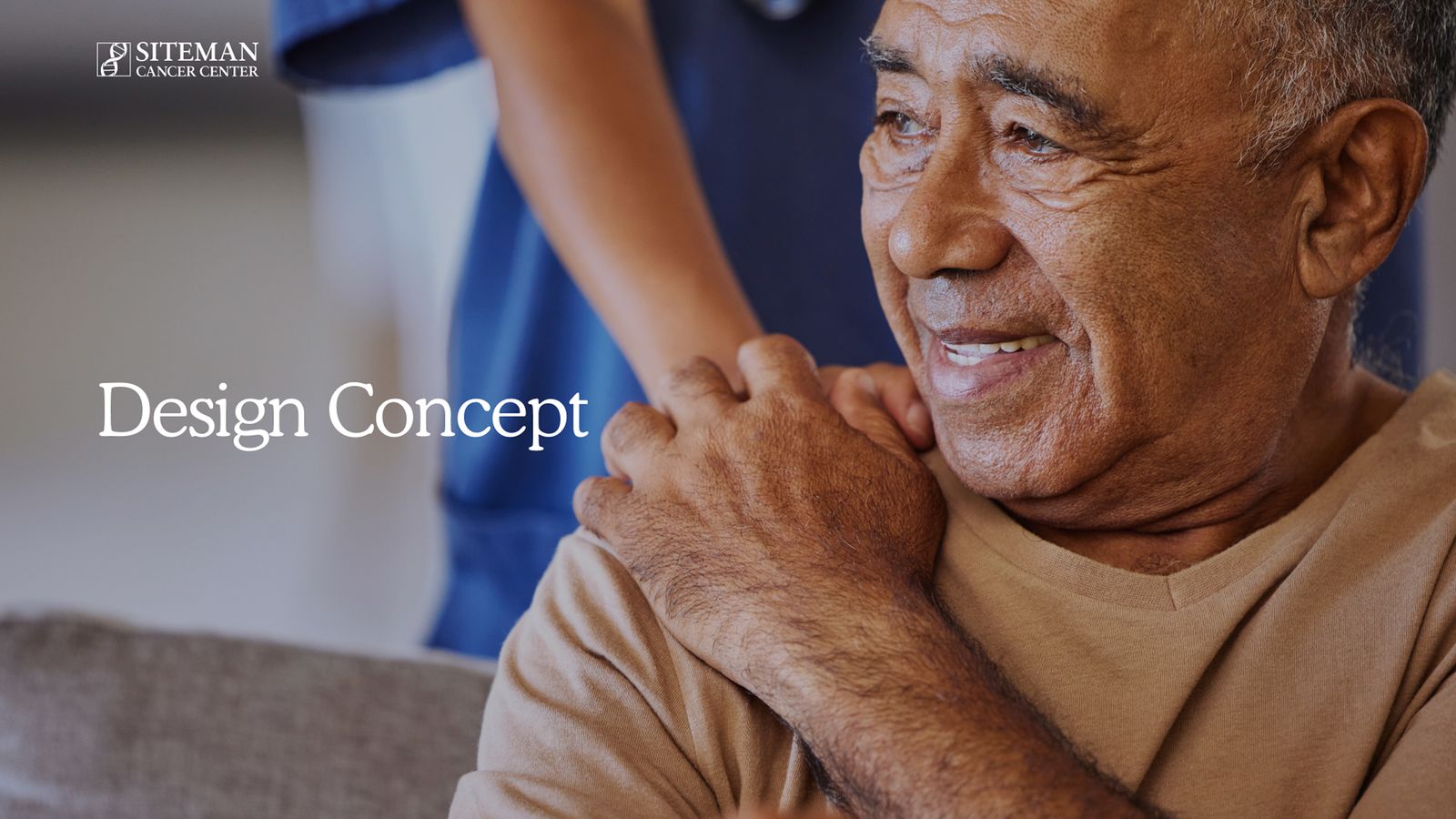
I kept the expertise as the foundation and worked to elevate the emotional and empathetic side of patient care in the design and content, to create a more patient-centered experience. The redirection balanced the essential messaging of institutional expertise with a more compassionate, emotionally aware approach, connecting with the patient base in a human way while maintaining Siteman’s strong reputation.
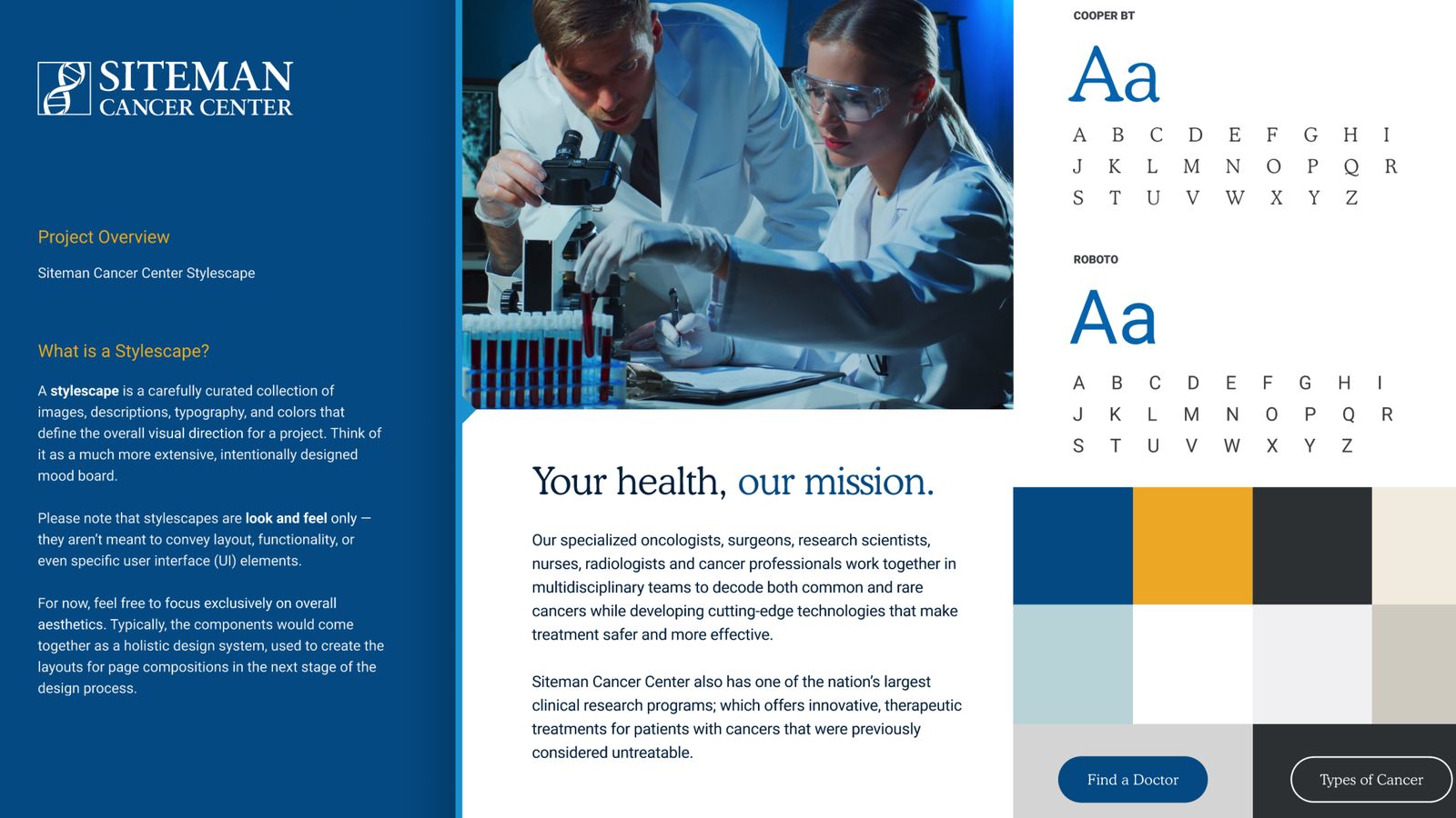
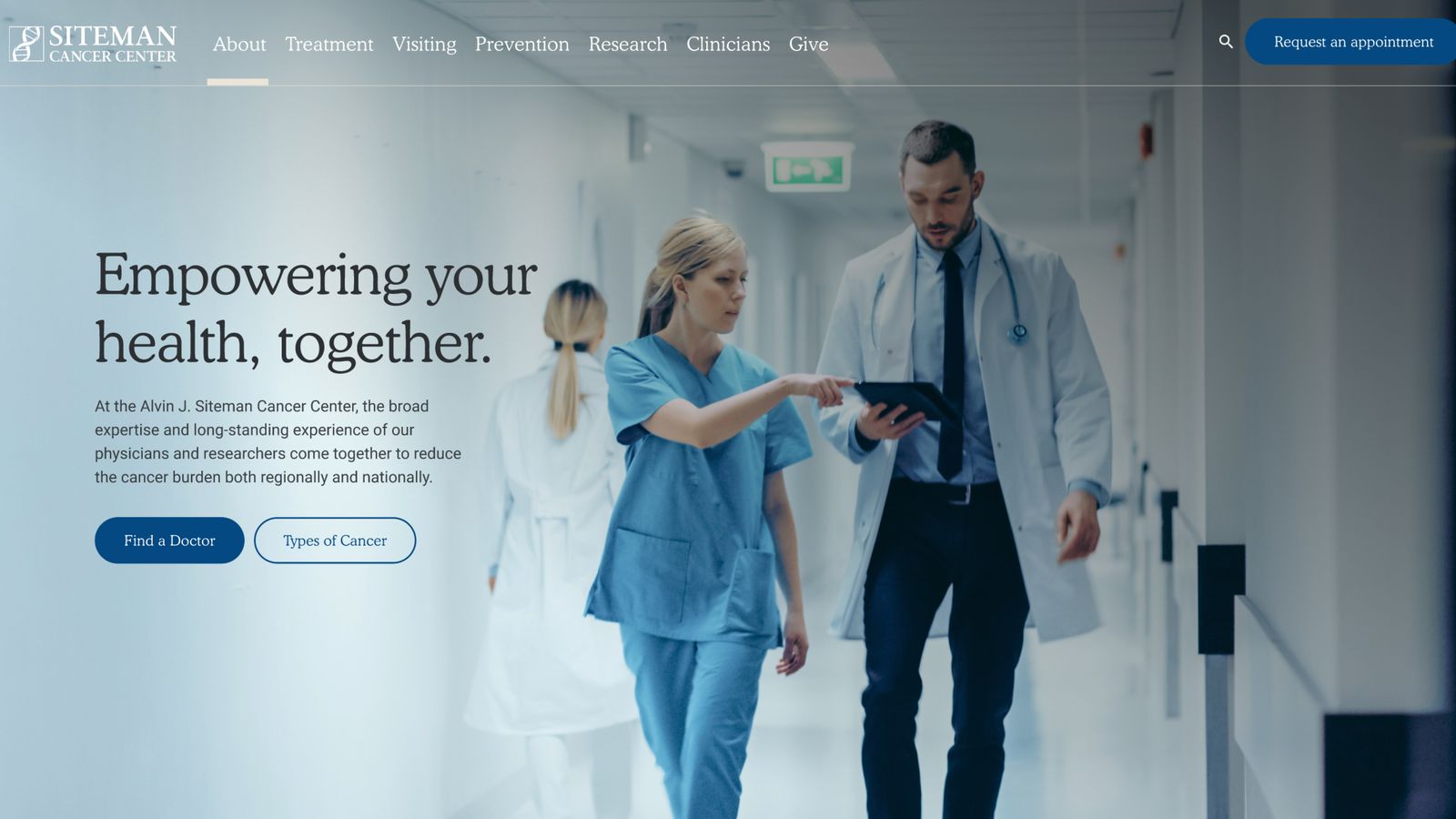
A proposed direction that holds two things at once. Siteman still reads as a world-class center, and it also feels like a place that understands the people it treats. The line the work was built around, world-class cancer care for real people, is the whole idea in a sentence.
world-class cancer care for real people