Baron Capital Group has spent four decades building a singular identity: long-term investors focused on growth companies with lasting competitive advantages, led by aligned and ethical teams. Their philosophy is rooted in deep fundamental research, ESG integration, portfolio rigor, and a disciplined valuation mindset.
Problem to solve:
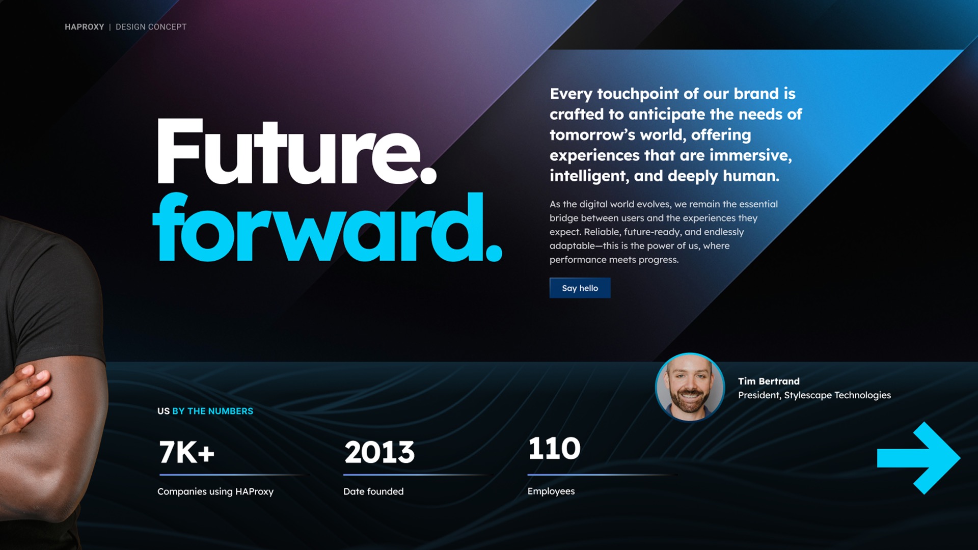
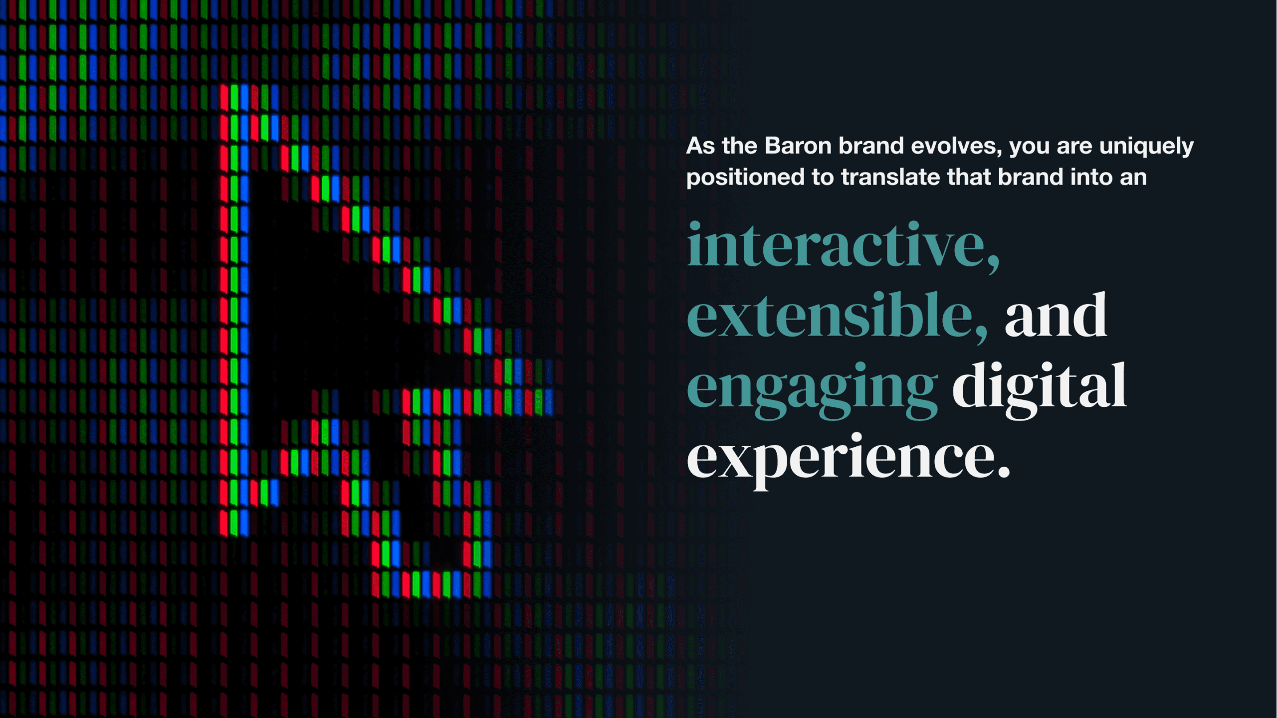
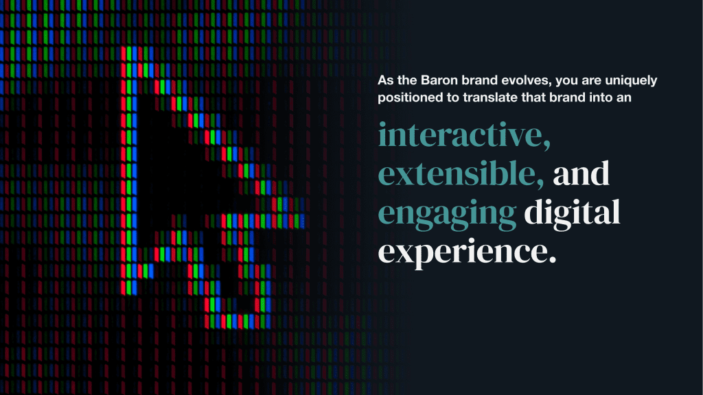
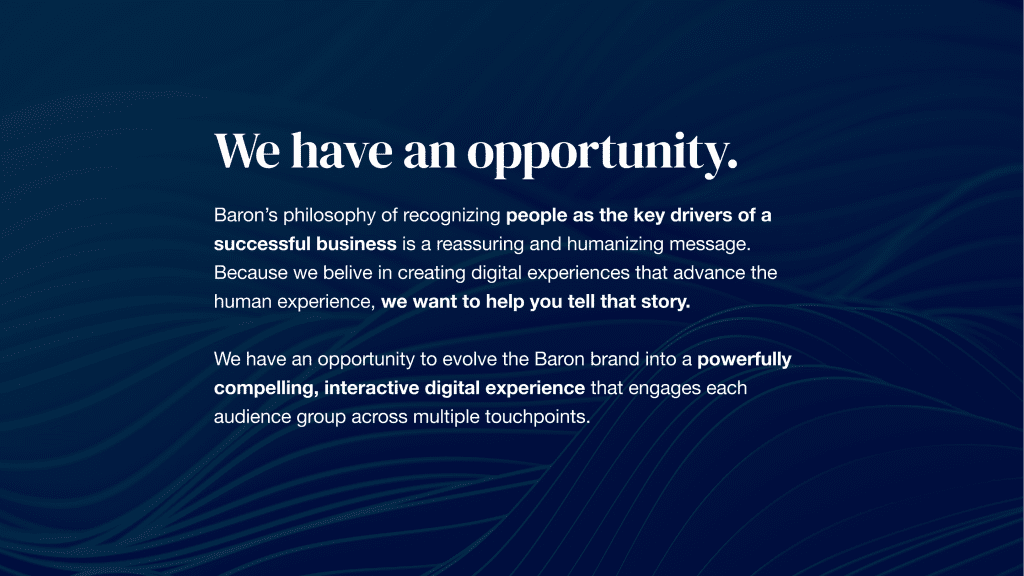
Baron’s website effectively communicates their performance, but as they evolved to emphasize ownership-style investing and deep research, their digital presence needed to evolve, too. The goal: transform an informational site into a living reflection of their investment ethos, where every interaction demonstrates their conviction, process, and purpose.
What I proposed:
1. Strategic Foundation
I began by dissecting Baron’s “One Firm, One Focus, One Investment Approach.” That gave me four pillars to build on: Idea Generation, Research, Portfolio Construction, Risk Management. These pillars became the guiding framework for the redesign.
2. Architecture that Aligns
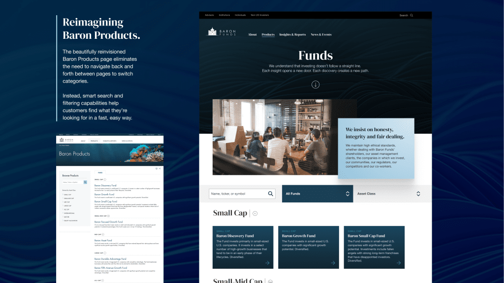
The site navigation and IA were restructured around those four pillars, with clear, distinct pathways that guide visitors (e.g., institutional investors, financial advisors, or individuals) through Baron’s process from inspiration to understanding to trust.
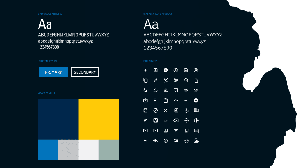
3. Design that Embodies Ownership
I shifted the visual tone to reflect a sense of long-term stewardship:
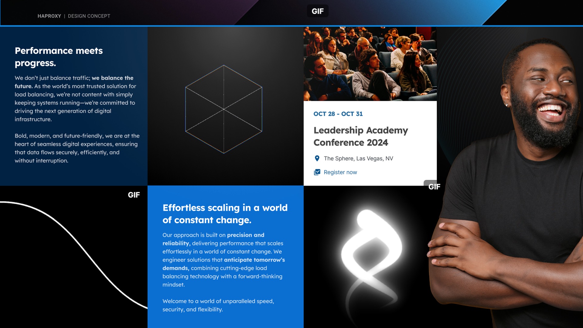
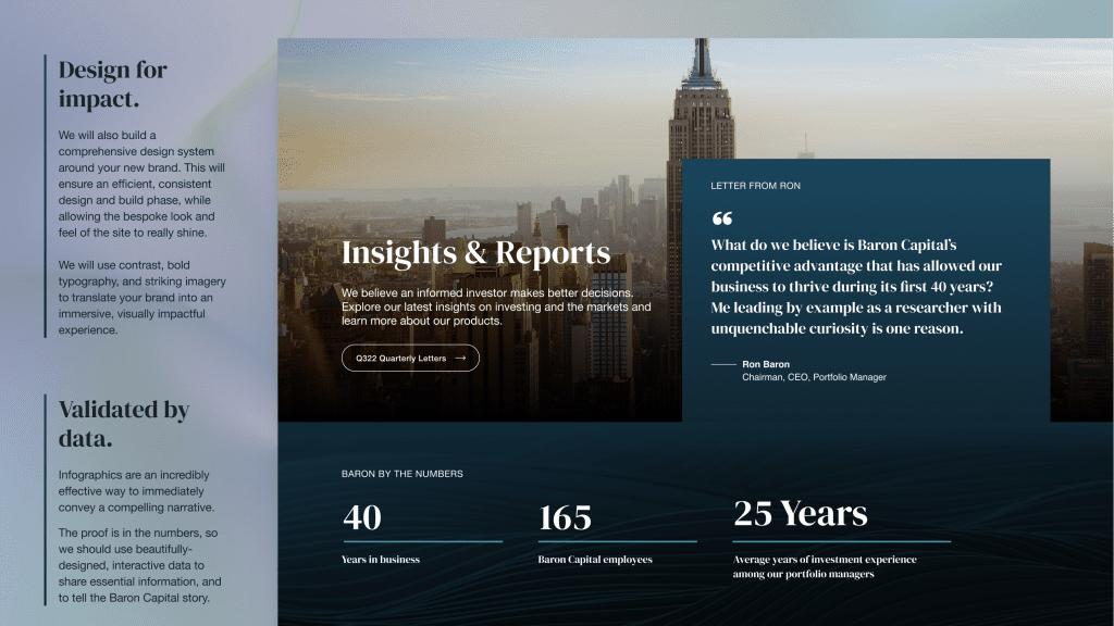
- Visual storytelling: Iconography and imagery depict growth themes—leadership, innovation, tenure.
- Interactive components: Timeline sliders and process walkthroughs bring “Idea → Research → Build → Manage Risk” to life.
- Typographic hierarchy: Confident, centered headlines; warm, readable body text that echo their human-led, rigorous approach.
4. Content that Speaks with Conviction
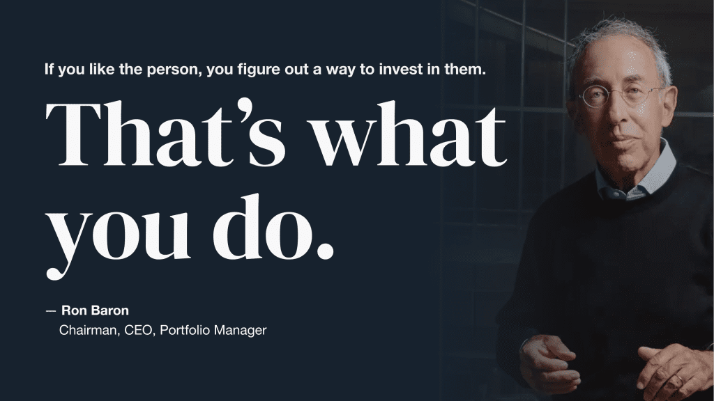
I rewrote key sections in their own voice, which is a blend of analytical depth and human clarity:
- “Our philosophy: We think like business owners.”
- “We don’t chase the market—we champion companies we believe in for the next decade.”
- I sprinkled in ESG insights, management interviews, and research highlights to demonstrate their ongoing diligence.
The Impact
While this was a proposed approach, here’s what our redesign unlocked:
- Clarity: Four-pillar structure helps diverse visitors quickly surface the content that matters.
- Credibility: A cohesive narrative, from funding to ESG to performance, supports trust.
- Engagement: Interactive modules deepen understanding and keep users exploring.
- Differentiation: Baron’s owner-investor stance becomes more visible and memorable.
Why It Matters
Baron Funds isn’t just another money manager. Their rigorous, long-term, ownership-minded identity is what makes them distinct. This proposed redesign gives Baron Funds a site that’s as purposeful as their chapters: built thoughtfully, invested wisely, and built to last. It also ensures that every click, every page, every visual element reinforces that identity, and helps clients connect to it.