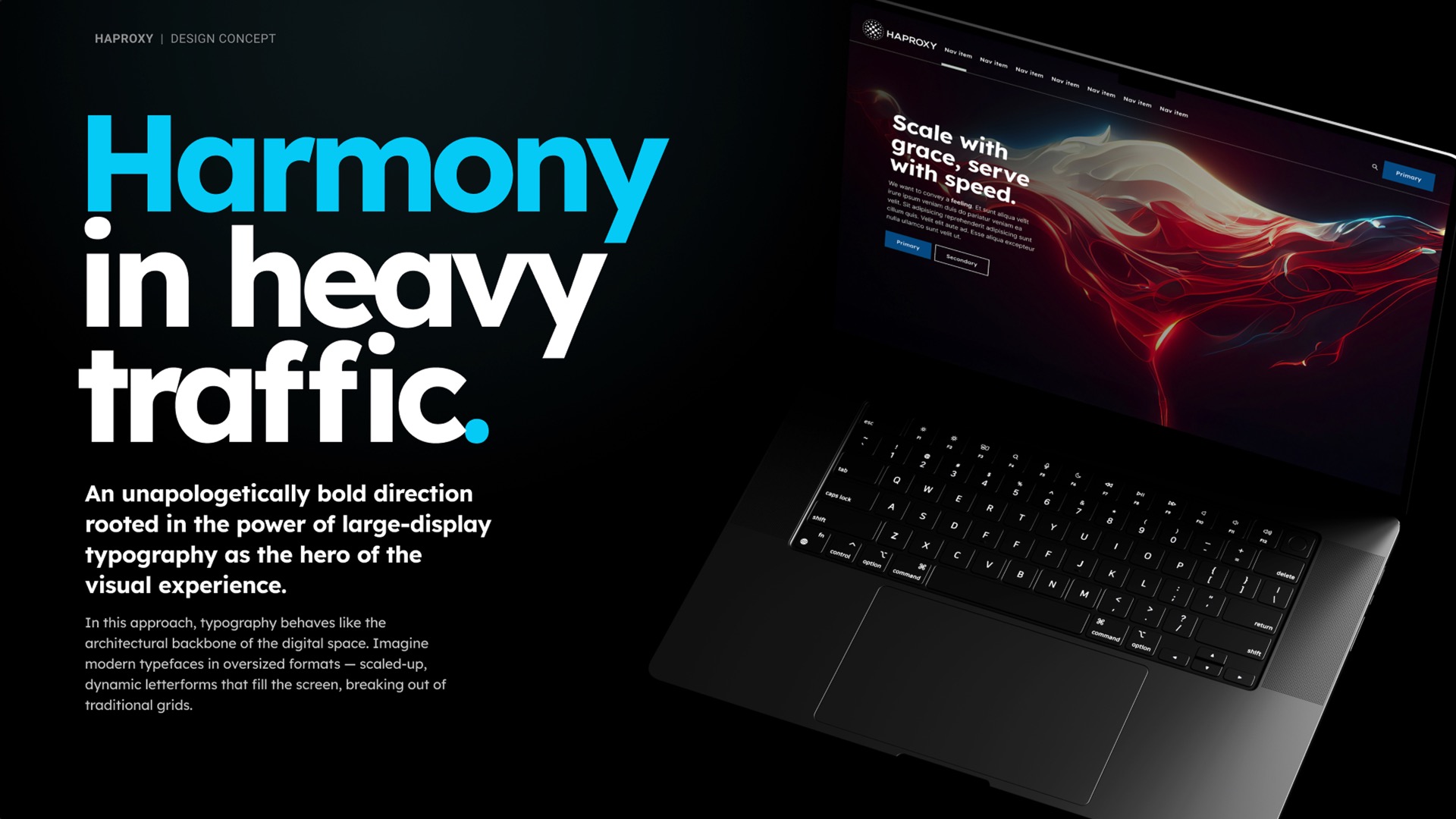
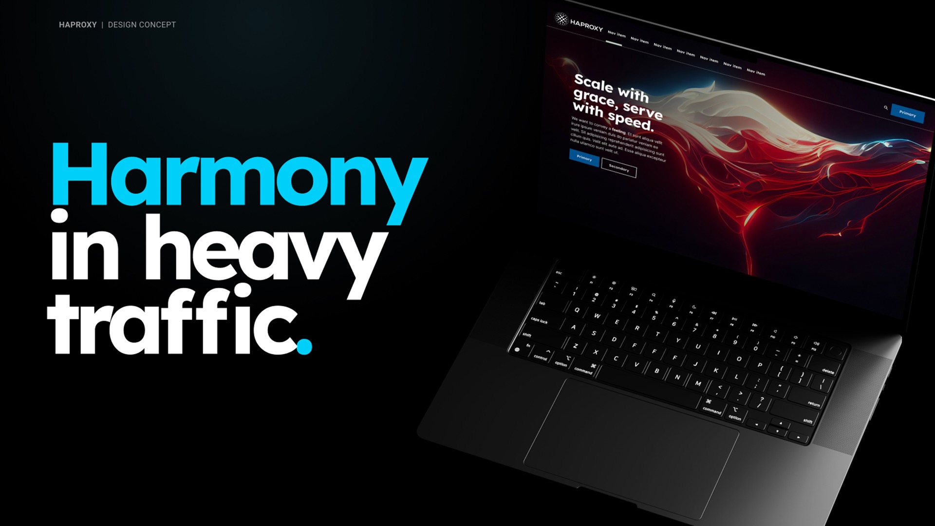
An unapologetically bold direction for HAProxy, rooted in the power of large-display typography as the hero of the visual experience.
Problem to solve:
HAProxy is known in the industry as the gold standard for reliable, high-performance traffic management and next-gen security. But over time, the brand outgrew its reputation as a company that just provided one specific offering: load-balancing technology.
There wasn’t clarity around the expanded offerings and powerful enterprise solutions offered by the company. We were challenged to evolve the brand to better reflect where HAProxy is now and where it’s going: bold, modern, and ambitious. It was also important to stay true to the qualities that built trust in the first place.
How I helped:
In this concept, I created a visual experience that relies on minimalist supporting elements. No clutter, no overuse of imagery or icons. The focus is on delivering impactful messages through bold typography and arresting images, whether they are emotional, provocative, or informative. Short, impactful phrases dominate the space, framed by negative space that enhances their power.
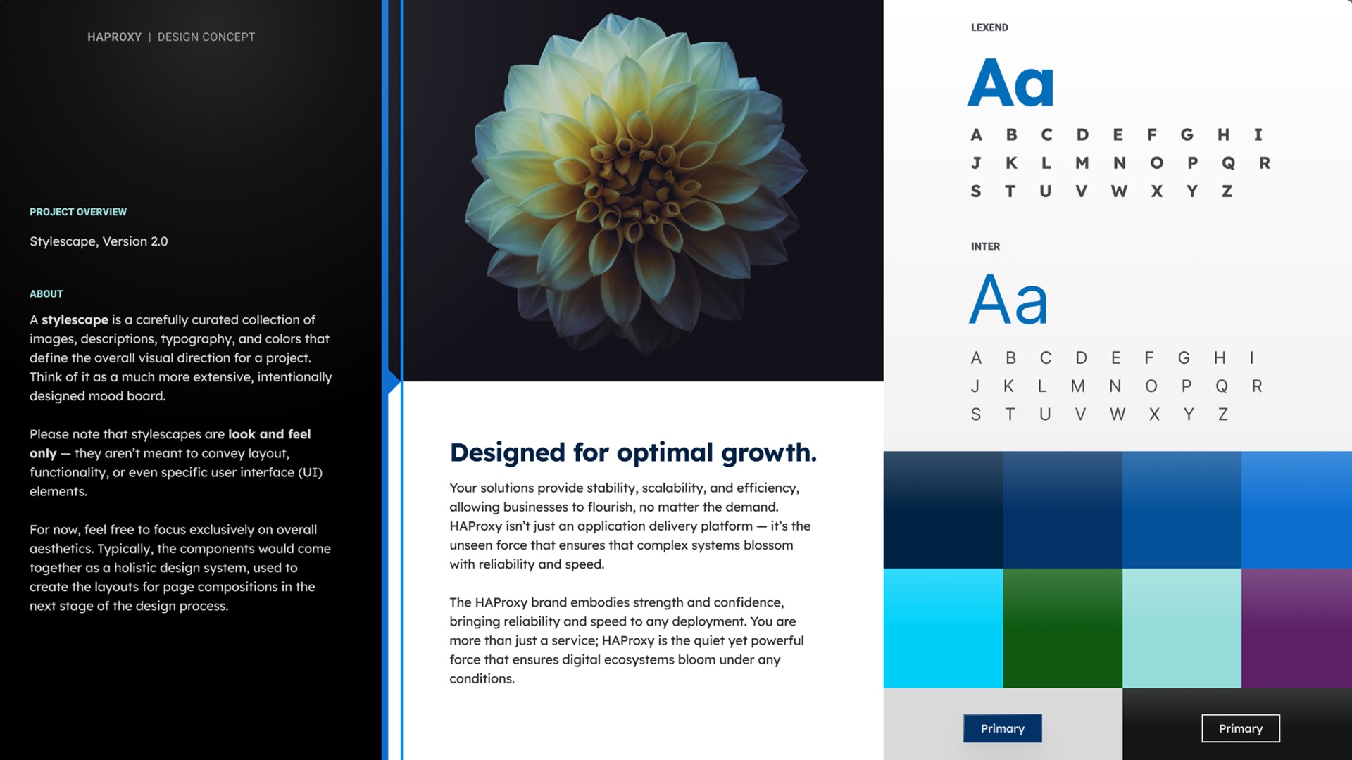
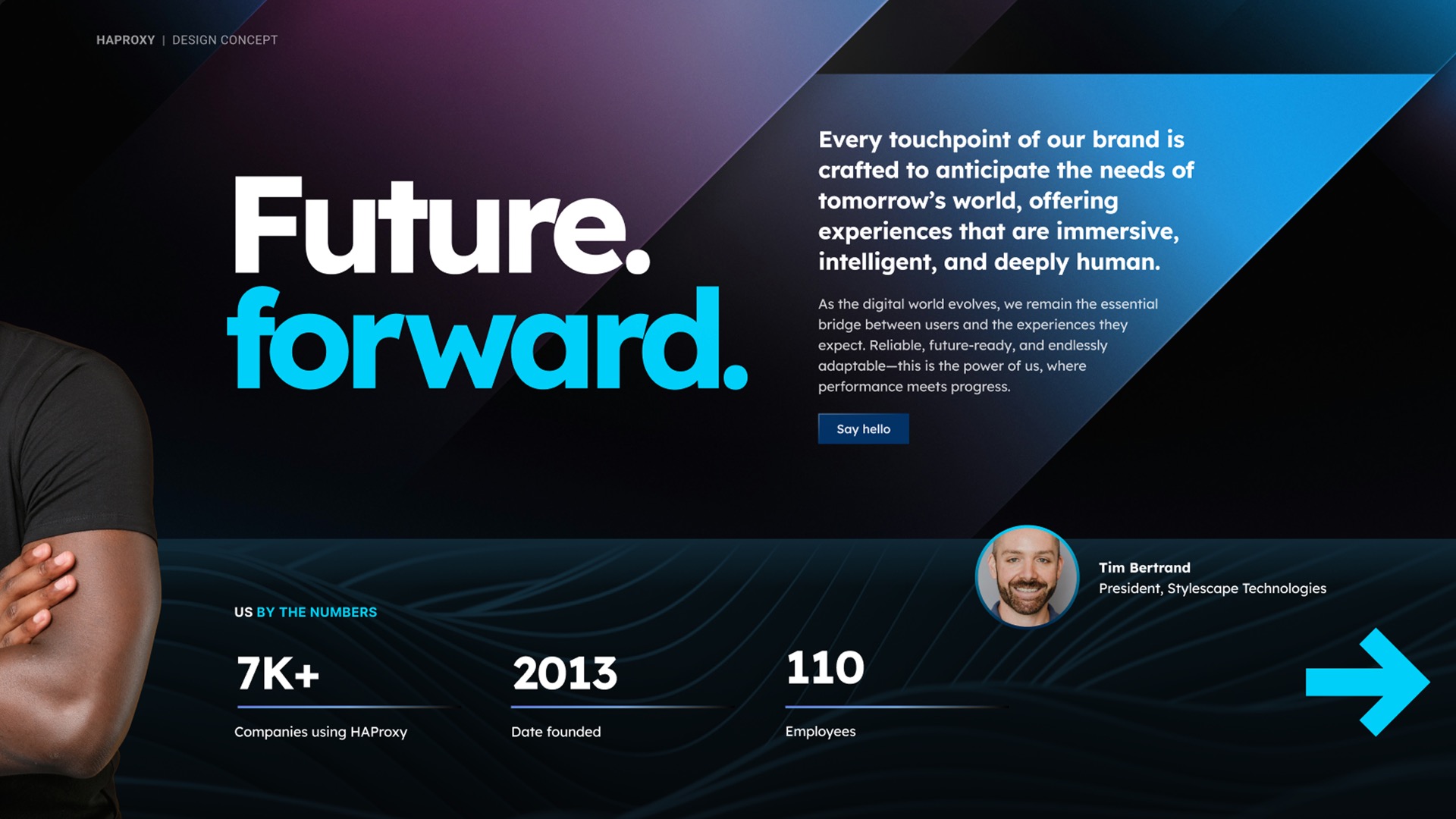
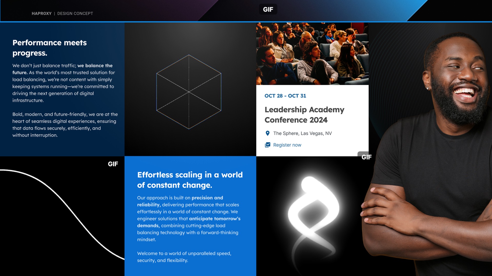
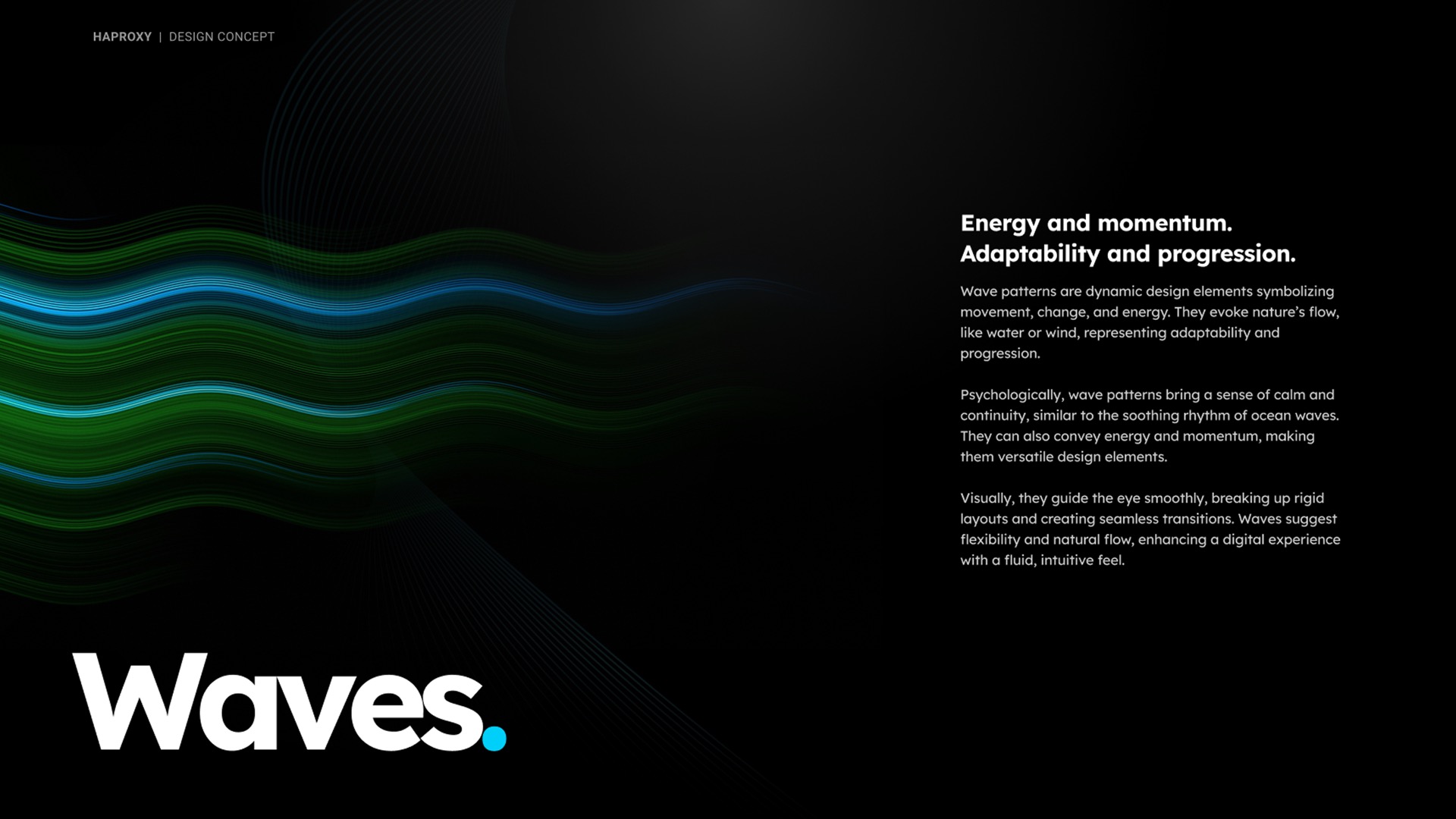
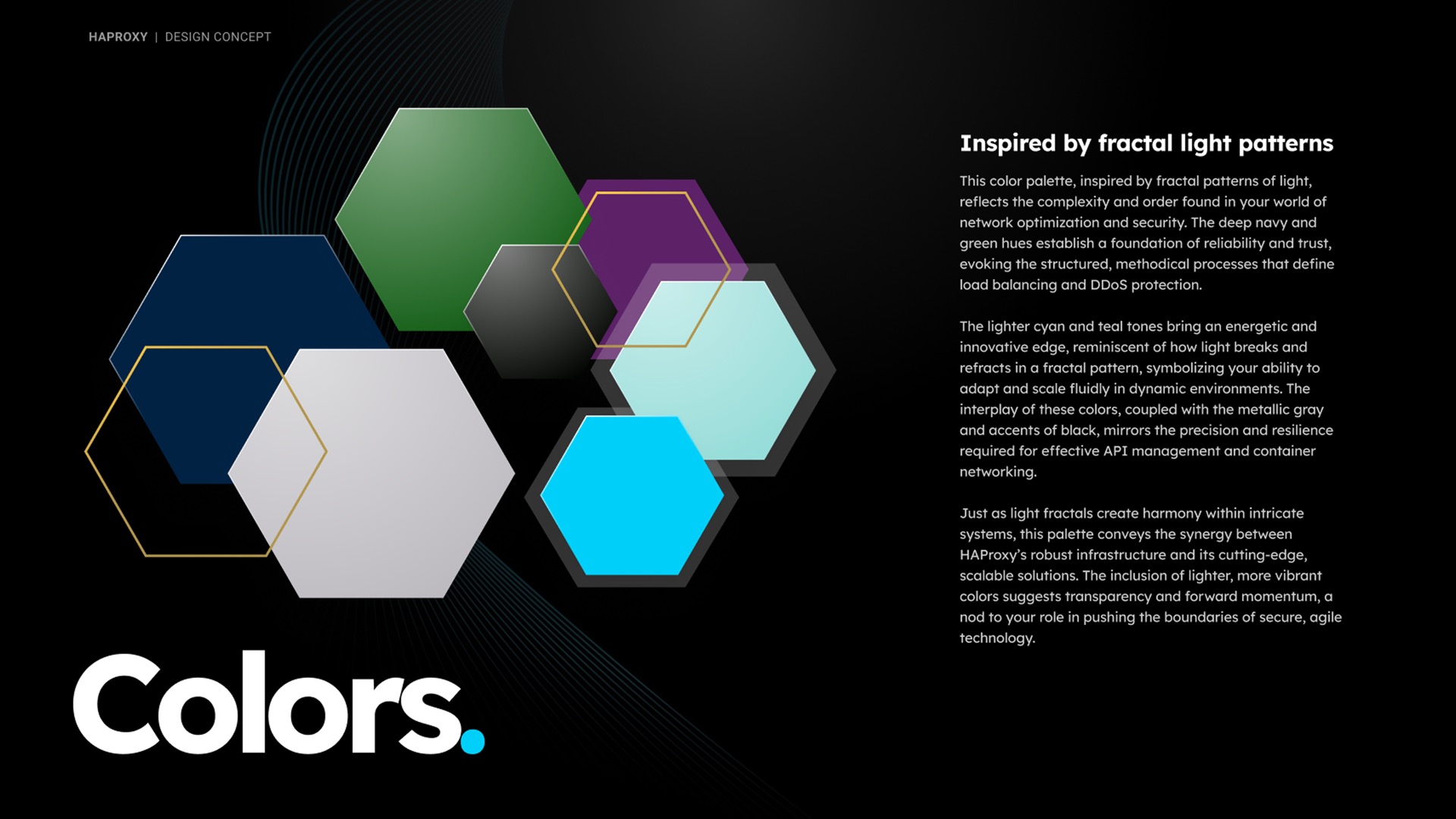
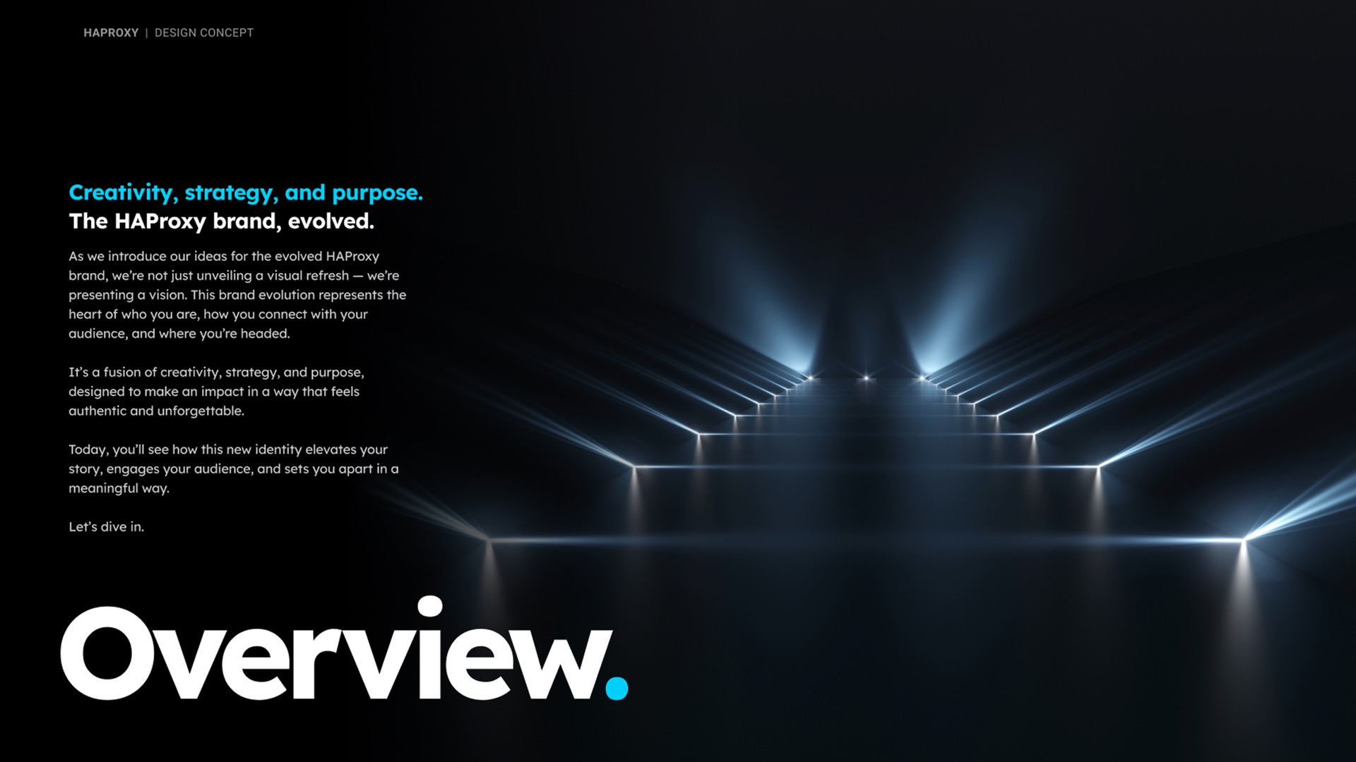
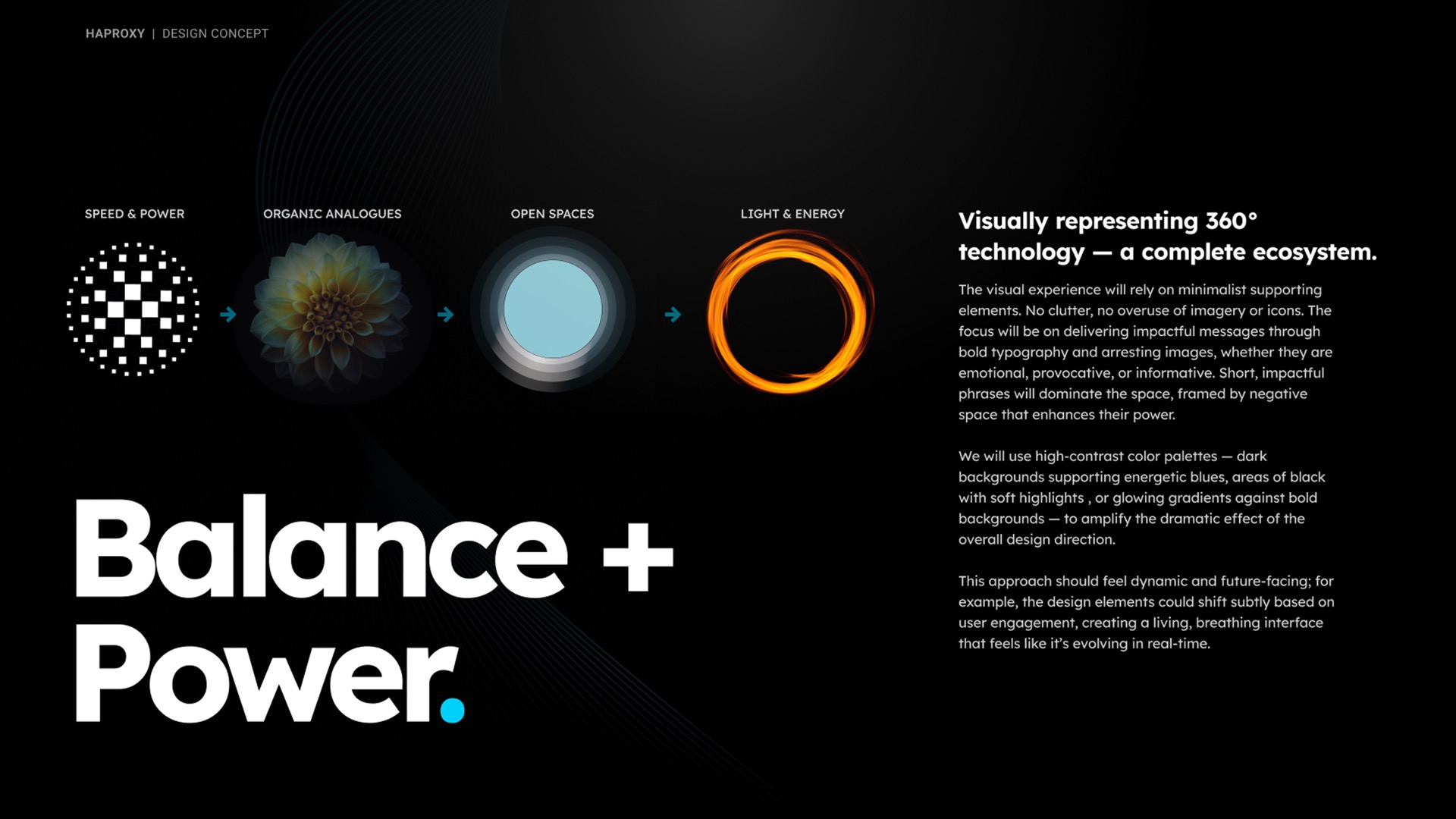
I used high-contrast color palettes — dark backgrounds supporting energetic blues, areas of black with soft highlights , or glowing gradients against bold backgrounds — to amplify the dramatic effect of the overall design direction.
This approach feels dynamic and future-facing; for example, the design elements shift subtly based on user engagement, creating a living, breathing interface that feels like it’s evolving in real-time.