moving a load-balancing name into an enterprise security brand.
A bold, typographic design direction built to move HAProxy past its load-balancing reputation without losing the trust that came with it.
HAProxy was known in its industry as the gold standard for reliable, high-performance traffic management. That reputation was also the problem. The company had grown into next-generation security and enterprise solutions, but most people still filed it under the one thing it started with: load balancing. The brand was a step behind the business.

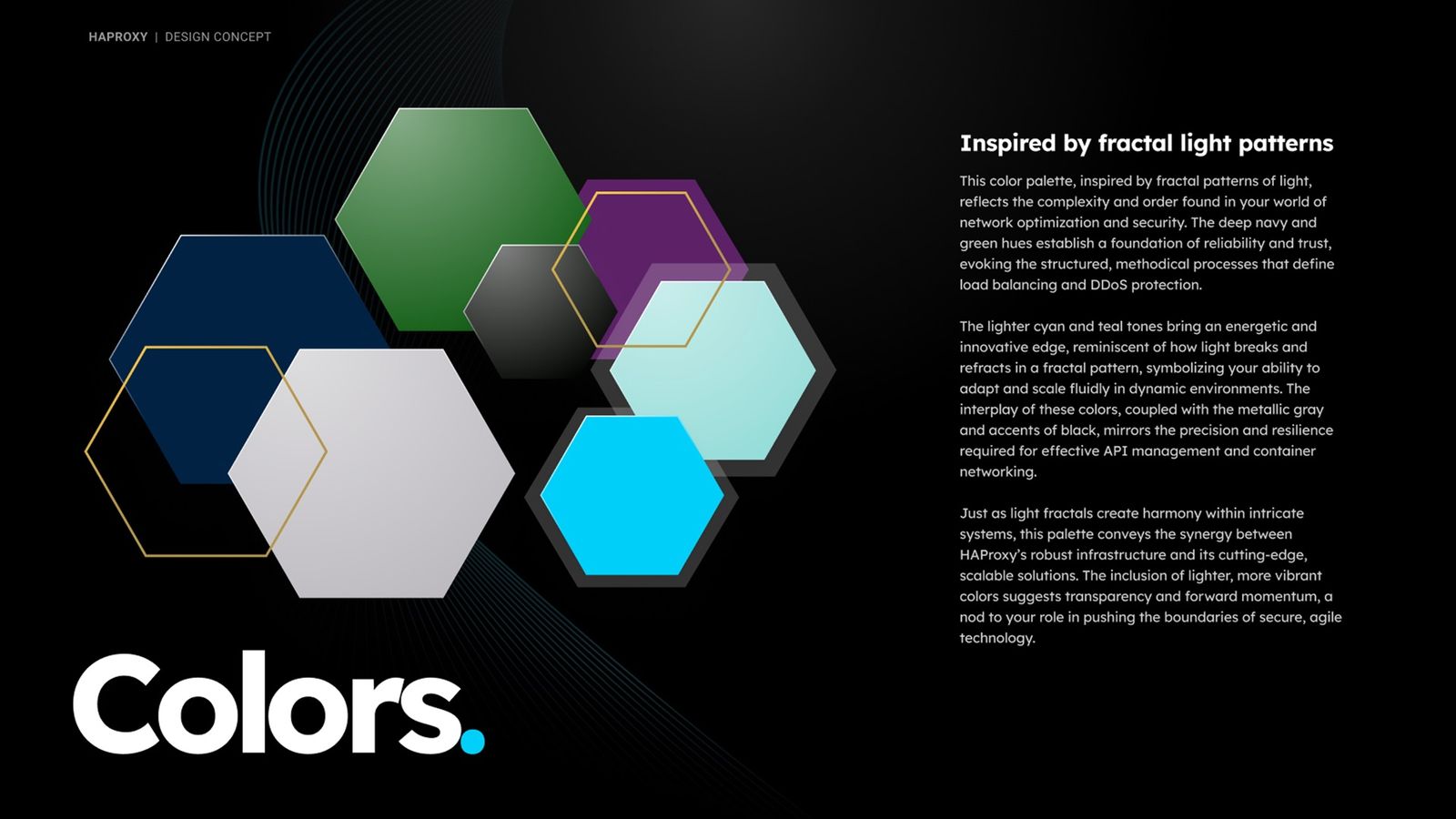
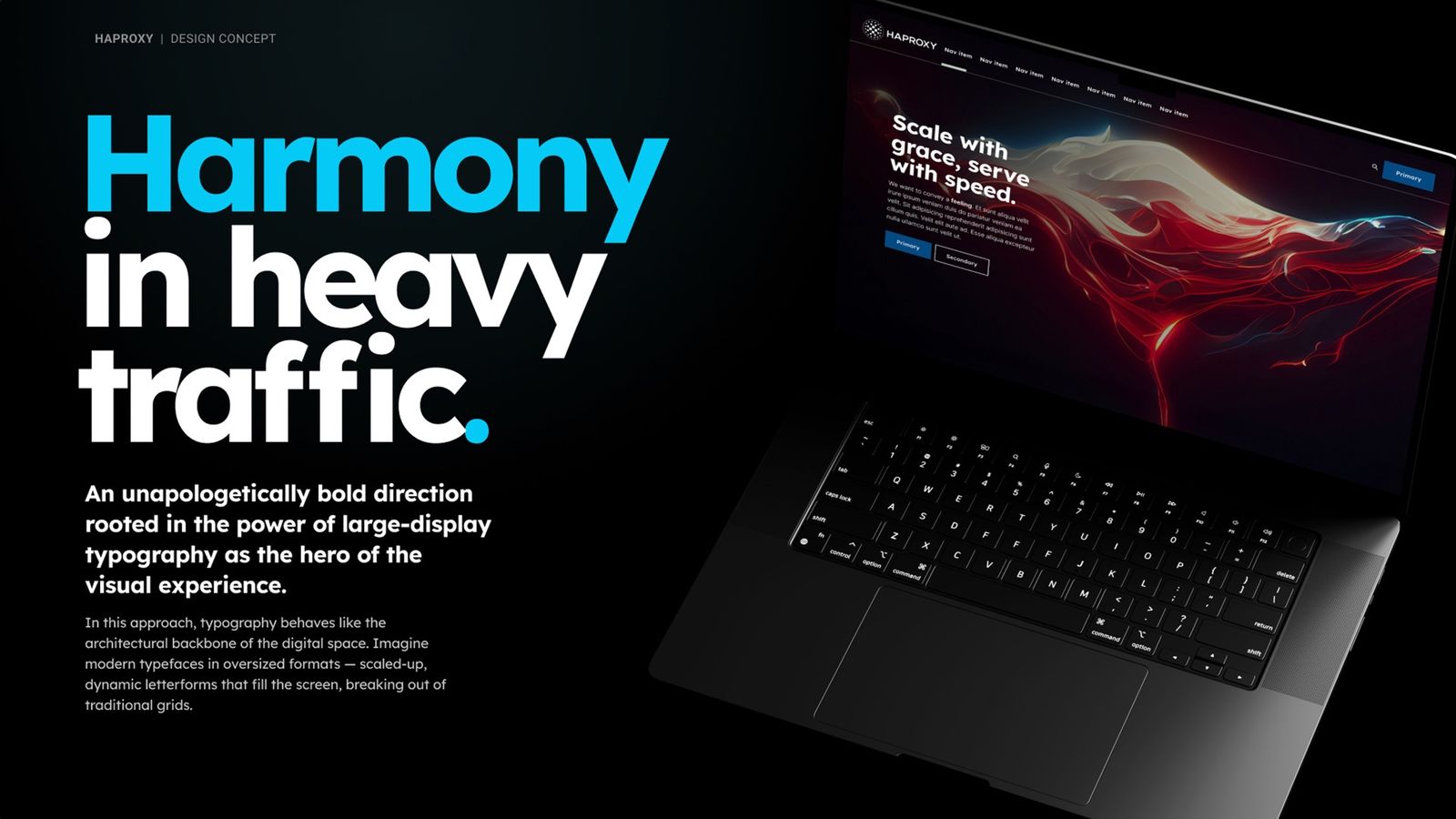
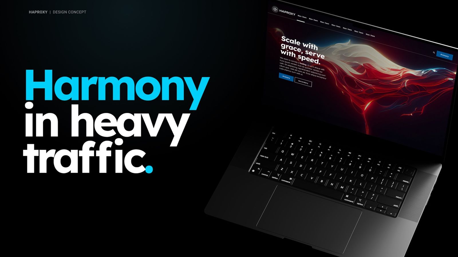
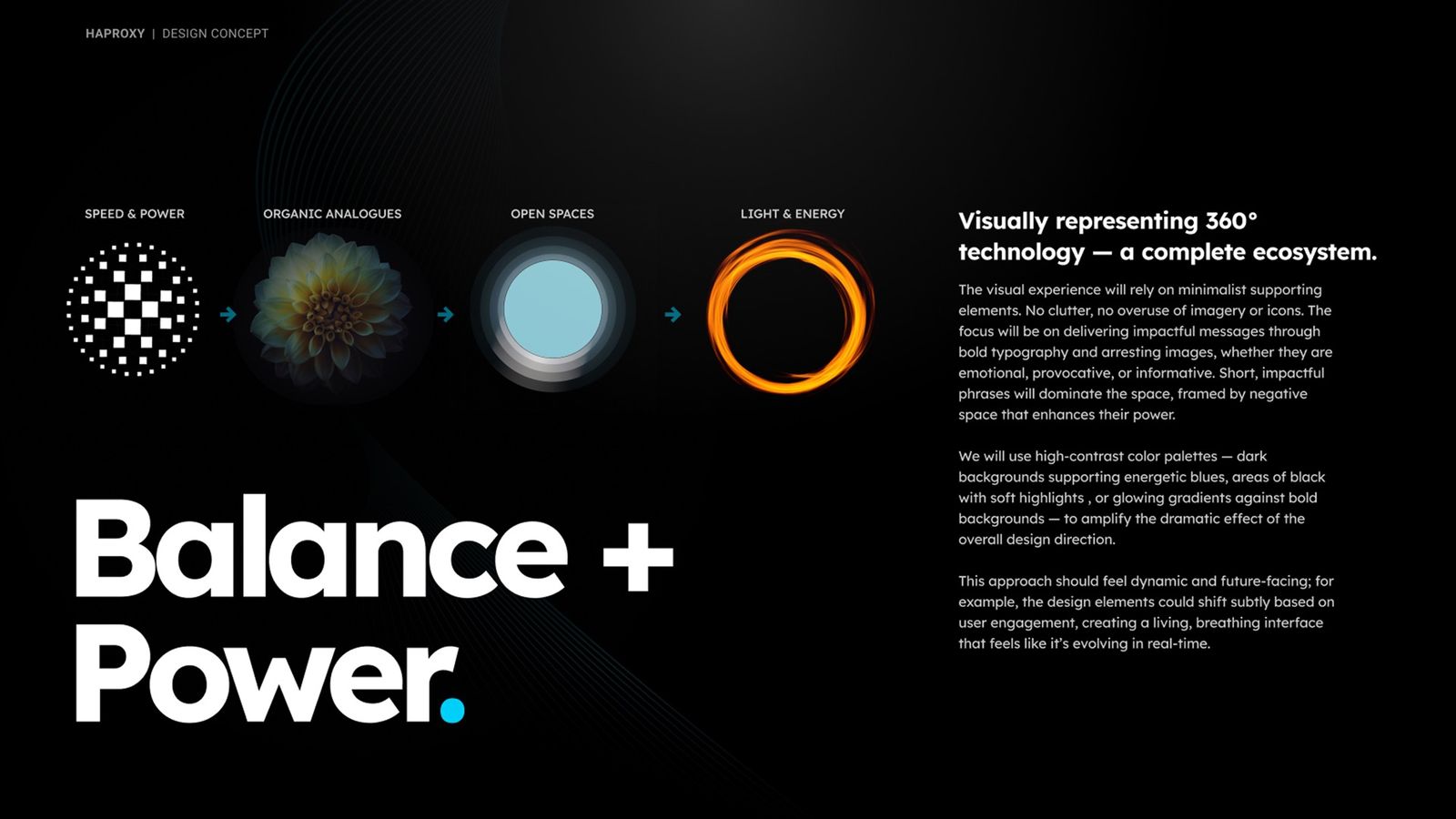
I created a design direction that gave the company room to look as ambitious as it had become. The approach was deliberately spare. Minimal supporting elements, no clutter, and bold typography carrying short, direct phrases as the hero of each screen. High-contrast palettes, dark fields with energetic blue and glowing gradients, and a lot of negative space gave the whole thing a modern, future-facing feel while holding onto the seriousness that earned HAProxy its trust in the first place.
A brand direction that reads as bold and enterprise-ready, matched to where the company is heading rather than where it began.
bold and enterprise-ready